BRANDING & UI DESIGN
Overview
Approach
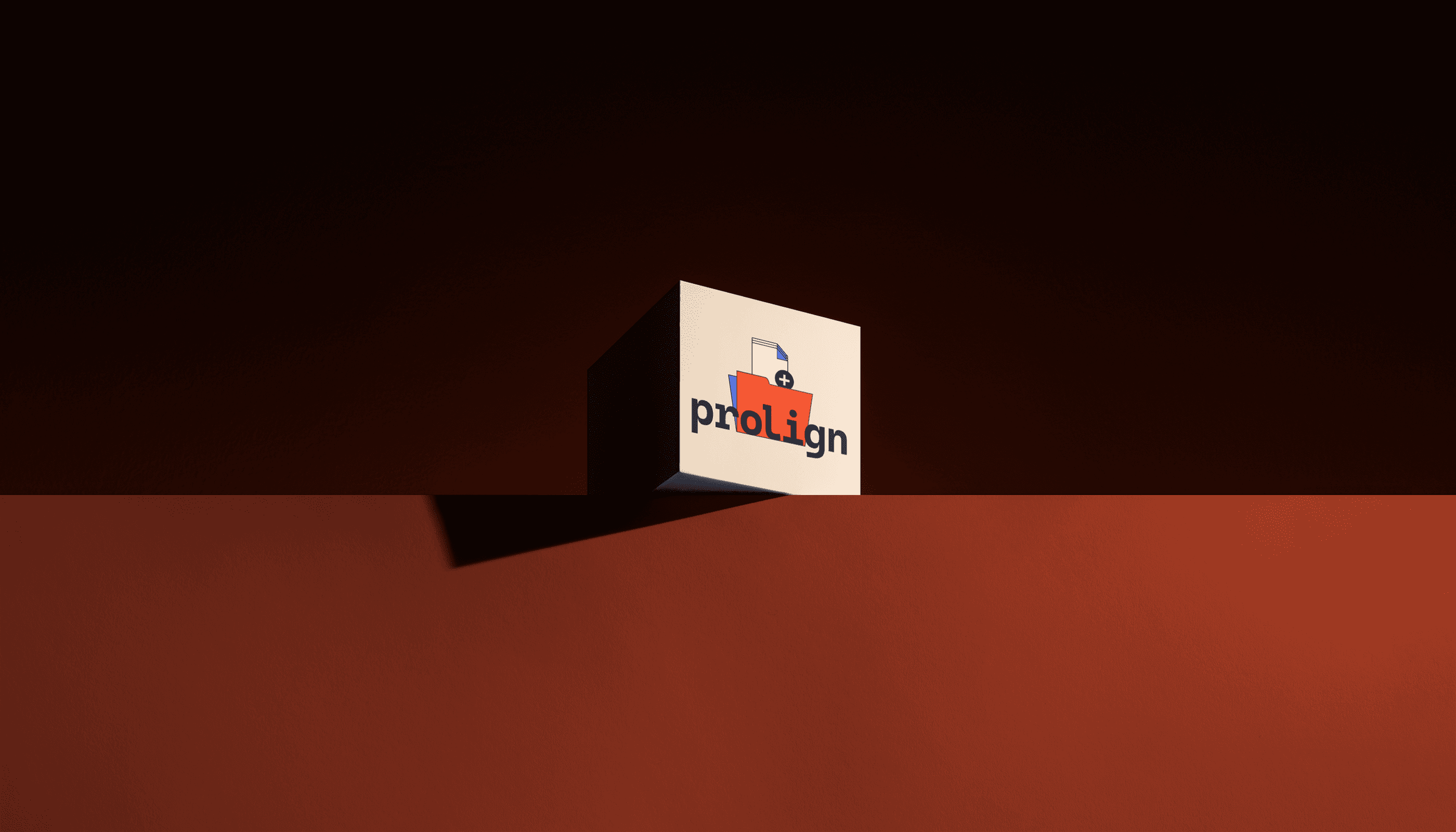
In our insightful conversations with stakeholders, a tapestry of defining terms emerged for Prolign: synergy, creativity, efficiency, precision, collaboration, innovation. Delving deeper, 'collaboration' and 'innovation' were earmarked as pivotal research nodes, guiding our font selection towards the monospaced elegance of Cascadia Code. This selection resonates deeply with innovation, as its unique structure challenges conventional norms, mirroring Prolign's trailblazing spirit. The modernity of Cascadia Code also seamlessly captures Prolign's innovative edge and technological prowess. Drawing from these insights, we sculpted a distinctive emblem for Prolign. A mark that not only encapsulates its core, but also aligns seamlessly with the brand's spirit. The result is a synthesis of words, ideas, and innovation – a mark that stands as the quintessence of Prolign's origin and purpose.